This step-by-step tutorial teaches you how to create a Pareto Chart in Google Sheets quickly, professionally, and scalable. In a hurry? Click here to download a Google Sheets Pareto Chart template. It’s free and ready for immediate use. Watch the video explaining how to build a Pareto Chart in Google Sheets.
Google Sheets Pareto Chart Tutorial (Step-by-Step)
1.1 – Build a 3-column dataset
- 1 column for the causes’ description – Here labeled as “Cause”
- 1 column for the absolute effect of each cause with a numerical value – Here labeled as “Complaints”
- 1 column for the relative effect of each cause with a percentage value – Here labeled as “% of Total Complaints”
3-column dataset example

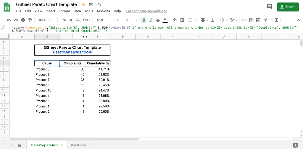
For a scalable approach, the dataset above can be generated automatically via a unique formula that puts everything in order regardless of your raw data input. To do so, use this query formula in Google Sheet:
=QUERY(RawData!A1:B,“SELECT A,SUM(B), SUM(B)/” & SUM(RawData!B:B) &” WHERE A IS NOT NULL GROUP BY A ORDER BY SUM(B) DESC LABEL SUM(B) ‘Complaints’, SUM(B)/” & SUM(RawData!B:B) & ” ‘% of to Total Complaints’ “)
What does this formula do?
- It extracts, summarizes, and sorts the “Causes” correctly. It assumes that your “Raw Data” input is in columns A & B of a separate sheet called “RawData,” like in the screenshot below. It conveniently handles the data regardless of how the data is input into your spreadsheet.
- It tailors the columns’ names using ‘LABEL’: Feel free to change it your way in the formula, depending on your context.
“Raw Data” located in columns A and B of the “RawData” sheet

Dataset generated via the formula located in cell B5 of the “DataPreparation” sheet

If you use the Google Sheet Query formula above, the data is already sorted the right way for a Pareto Chart or Pareto Diagram. If you use a manual method to build this dataset, ensure that data is sorted by “Effect” descending order and that all the relevant data input is captured. In this example, the “Effect” is the number of “Complaints” for each product (“Causes”).
1.2 – Extend The 3-Column Dataset With a “% Cumulative” Column
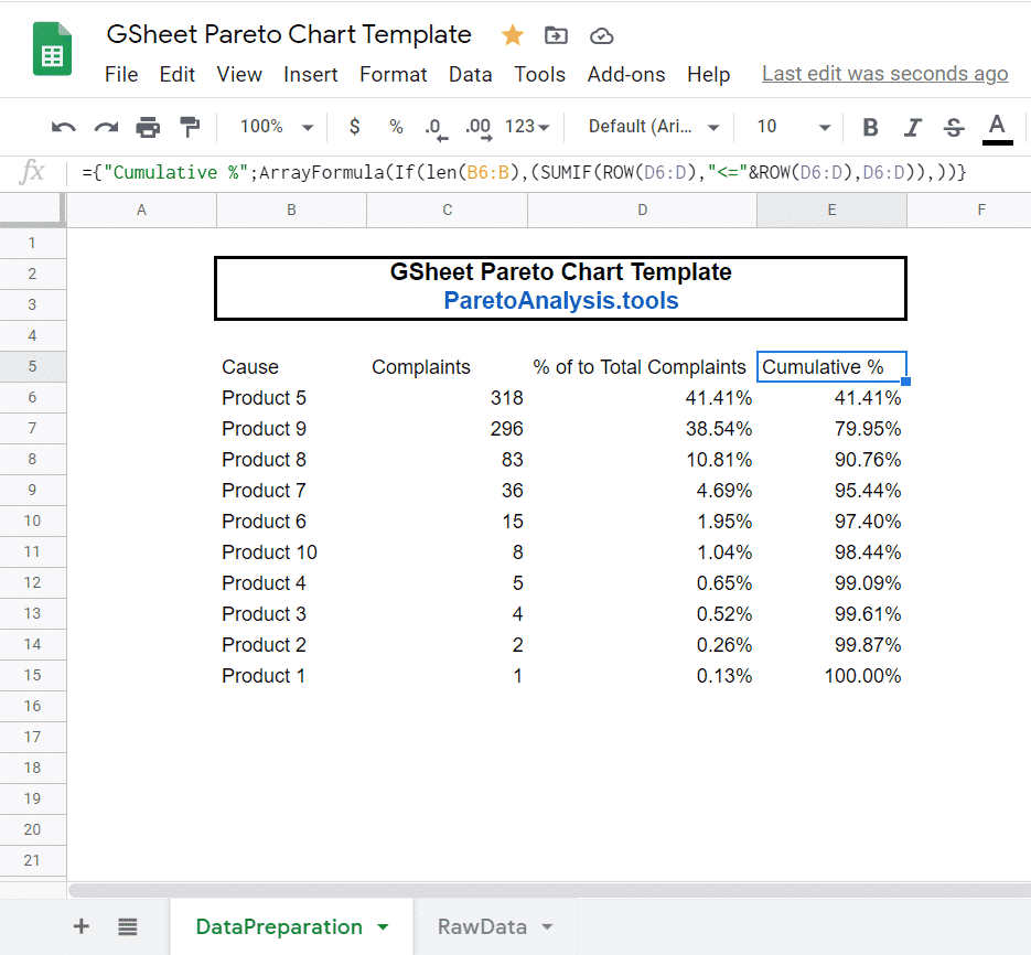
To do so apply the Google Sheet array formula below (in the cell E5 of the Pareto Chart template):
={“Cumulative %”;ArrayFormula(IF(LEN(B6:B),(SUMIF(ROW(D6:D),”<=”&ROW(D6:D),D6:D)),))}
What does this formula do?
- Like the first formula, it generates the rights numbers and adjusts automatically to the size of your data.
- It calculates the cumulative effect of each cause: sum of the relative effect of the cause with the relative effects of the previous causes having a greater effect.
“% Cumulative” column in the “DataPreparation” sheet is generated automatically
by the array formula located in the cell E5

1.3 – Hide the Third Column of the Dataset
Hide the column D “% of total effect” (Labelled here as “% of total Complaints”) as this data is not required for the Pareto Chart.

2.1 – Select the dataset:
Select the 3 columns required to draw the Pareto Chart:
- The causes’ descriptions
- The absolute effect of each cause
- The cumulative relative effect of each cause
3-column dataset ready for a Pareto Chart:

In the Menu, select “Insert” then “Chart”

The initial Pareto Chart in Google Sheets has a format that needs to be adjusted via the Chart editor

2.3 – Adjust the Pareto Chart format for the series “Cumulative %”
In the “Chart Editor”, under the right tab “Customize”, select “Cumulative %” under > “Series”. Then select “Right axis” under “Axis”
Adjust the Format: Chart Editor > Customize > Series > Cumulative % > Axis > Right Axis

Final Pareto Chart

Congratulations for making it till the end!
Feel free to reuse the template used in this Google Sheets Pareto Chart tutorial by using the link below.
Pareto Chart in Google Sheets – Ready-to-use Template
The Google Sheets Pareto Chart template used in this tutorial can be downloaded here:>> Access and Make a Copy of the Google Sheets Pareto Chart Template <<
Pareto Chart In Google Sheets – Tutorial Conclusion
A Pareto Chart or Pareto Diagram in Google Sheets is not a built-in chart type, unlike Excel. It remains easy and quick to make a Pareto Chart in Google Sheets, and Pareto Charts are excellent tools to get a quick grasp of key business drivers. At the very least, a Pareto Chart is helpful to detect any significant trend that may exist in your data. By looking at a Pareto Graph, you may find beneficial insights, quick wins, easy fixes to improve your company’s operational efficiency, and even exciting news to use in professional presentations! Insights given by your Pareto Chart can help you to decide rationally what business projects really matter relatively to others. This discrimination step provides you with a solid basis for proven project prioritization methods, such as the Eisenhower Matrix.
“A good business strategy is an operational execution driven by a Pareto Analysis”
Why building a Pareto Chart With Google Sheets?
A Pareto Diagram or Pareto Chart in Google Sheets helps to turn data into clear visualizable actionable insights. It highlights what really matters by putting emphasis on the most important drivers of a phenomenon.
Using Google Sheets to make a Pareto Chart or Pareto Diagram is a robust choice. Google Sheets is cloud-based spreadsheet software that conveniently allows you to access it from anywhere, as long as you have an internet connection. It also provides advanced collaborative features and makes your life easier to share your business insights. You can use Google Sheets with Google’s free account for personal use or a G Suite account for business use.
To create a Pareto Chart or Pareto Diagram with Google Sheets, log in to docs.google.com/spreadsheets/ then follow this tutorial.
A Pareto Chart illustrates the Pareto distribution that may exist with your data. A Pareto Distribution is observed when the Pareto Principle holds. The Pareto Principle (or “20-80 rule” or “Law of the Vital Few”) states that, for many events, roughly 80% of the effects come from 20% of the causes. As an example, illustrations in this tutorial show that 80% of the customer complaints ensue from only 20% of the products. For more details about the Pareto Principle, please refer to the FAQ by clicking here.
Pareto Chart In Google Sheets – Example

Table of Contents


0 Comments
Trackbacks/Pingbacks